With radiobutton properties, you can view and change the properties of the radiobutton. For creating a radiobutton, you need radiobutton command.
-
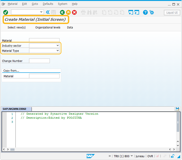
In this article, we will be explaining you the radiobutton properties with a screen customization example, running on Create Material screen. The tcode is MM01. Navigate to MM01 transaction and make sure to activate Liquid UI button. The MM01 screen will appear as following:
-
As shown in above figure, Industry sector and Material Type has dropdownlist. We can customize the screen by replacing the dropdownlist with radiobuttons.
-
To initiate the process, delete the Industry sector and Material Type fields. The screen now appears as following:
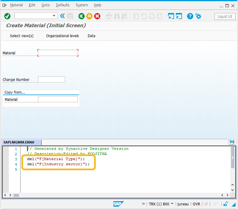
//Delete Industry Sector and Material Type inputfields del("F[Industry sector]"); del("F[Material Type]"); -
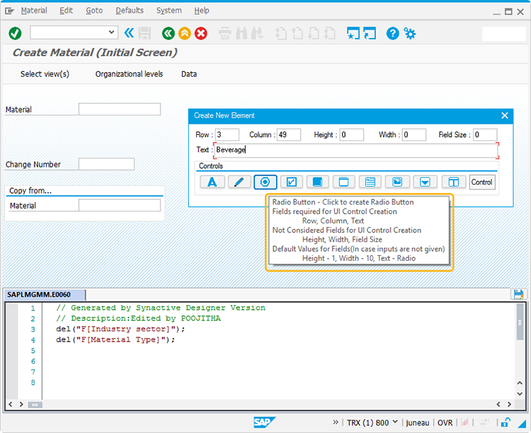
Perform right click on the WYSIWYG editor. The Create New Element window will popup. You will get a tooltip when you place the cursor on the radiobutton. It will display the fields required for UI control creation and provides you with the default values of radiobutton:
- Height - 1
- Width - 10
- Text - Radio
-
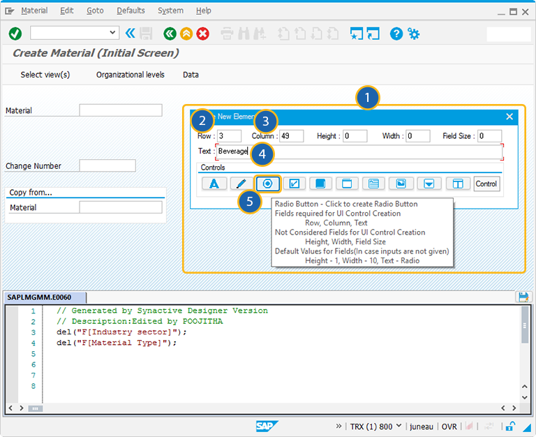
For creating the radiobutton control, follow the below steps:
- Right click on the screen to view the Create New Element window.
- Enter the Row coordinates of the screen.
- Enter the Column coordinates of the screen.
- Provide the Text to add the label name for the radiobutton.
- Click on radiobutton to create the radiobutton on the screen.
-
Position the radiobutton on the screen. You can always reposition it by just adjusting the screen coordinates of the radiobutton on the screen.
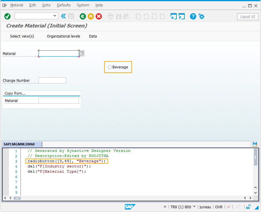
//Create radiobutton on the screen
radiobutton([3,49],"Beverage");
-
Similarly add more radiobuttons to the screen. These radiobuttons now resembles the values of dropdownmenu. Replace the Industry sector inputfield with Groupbox around the radiobuttons as shown below:
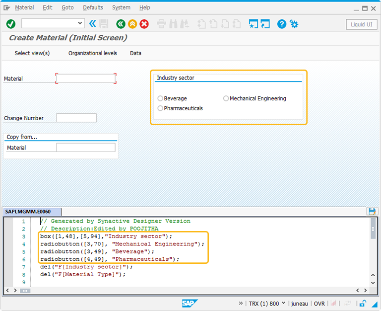
//Create radiobuttons on the screen
radiobutton([3,70],"Mechanical Engineering");
radiobutton([3,49],"Beverage");
radiobutton([4,49],"Pharmaceuticals");
//Create a Groupbox for Industry Sector
box([1,48],[5,94],"Industry sector");
-
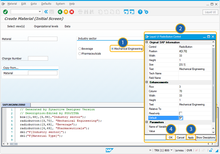
Double click on the radiobutton to select the radiobutton properties. A popup window will appear as following:
-
As per the demonstration, the radiobuttons replaces the dropdownlist. Similarly, add the Groupbox and radiobuttons for Material Type field like below:
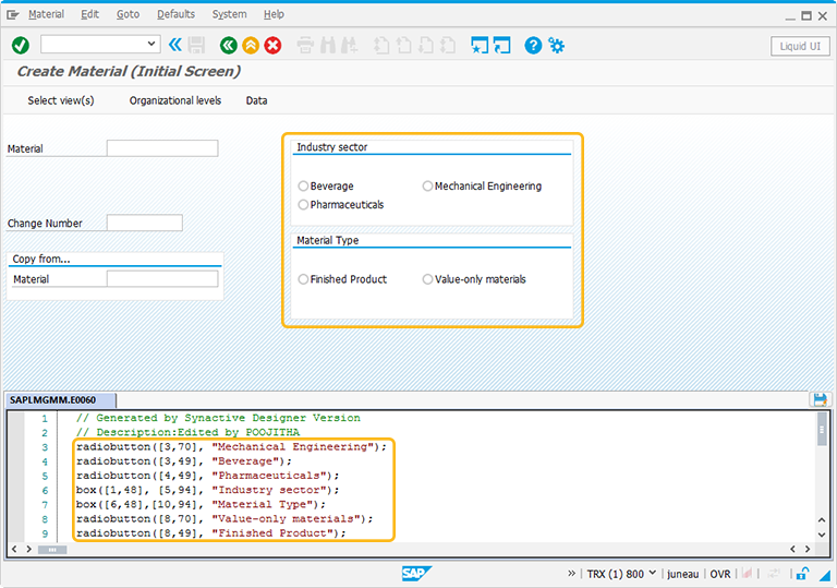
//Create another Groupbox for Material Type
box([6,48],[10,94],"Material Type");
//Create radiobuttons on the screen
radiobutton([8,70],"Value-only materials");
radiobutton([8,49],"Finished Product");
Click here to know about how the radiobuttons surrounded by a groupbox.
The Property window is categorized into three sections:
- Original SAP Information: The information provided in this section is not editable. Every Radiobutton has following properties:
- Control: Specifies the screen element.
- Position: Specifies the onscreen coordinates of Radiobutton. This is a read-only field - it is not user-modifiable.
- Width: Specifies the width of Radiobutton in pixels.
- Height: Specifies the height of the Radiobutton in pixels.
- Size: Specifies the coordinates of the Radiobutton in [Width, Height].
- Text: Specifies the onscreen label name of the Radiobutton.
- Tech Name: This field maintains the GuiXT technical name of the Radiobutton.
- Field Name: This field specifies the field name of the Radiobutton. The field name for the Radiobutton is R[Text].
Note: Original SAP Information parameters are non-editable.
- Enhancements: To edit the Radiobutton property, you can edit with Enhancements. It includes the following options:
- Row: Specifies the onscreen row number of the Radiobutton.
- Column: Specifies the onscreen column number of the Radiobutton.
- Width: Specifies the width of Radiobutton in pixels.
- Height: Specifies the height of the Radiobutton in pixels.
- Text: Specifies the onscreen label name of the Radiobutton.
- Read-only: Pre-select the Read-only option to make the Radiobutton as not editable.
- Default: Select this option to make the Radiobutton as pre-selected.
- Parameters: The Parameters tab enables you to link a variable with a specified value. It has the following fields:
- Name of Variable: Assign the variable name to access the Radiobutton dynamically
- Value: The 'Value' field will become editable after providing a variable name. You can enter the value you wish to link with your new variable.
- Fields and Values: Enables you to enter values for the field to be modified. This tab is used during multiple selections, such as order types. The tab has following options:
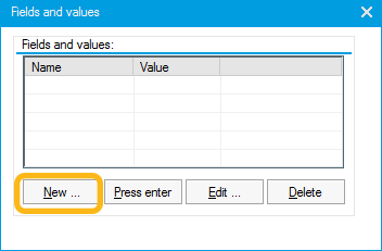
- New: Specifies a new field-value pair. To enter a new field-value pair, please do the following:
- Click the New button. You will get an Edit Field Value window.
- Enter a selection from the resulting list. If there are no values available, the list will be blank and you can enter a custom value in the Value field.
- Press enter: This Press enter button will cause the Radiobutton to send an Enter command.
- Edit: Enables you to edit an existing field-value pair. To edit, you need to first select a pair from the list and then click the Edit button. You can now edit the Field and Value.
- Delete: The Delete button will delete the selected field-value pair.


