The properties dialog for the image element contains three tabs, as follows:
You can modify the properties for the image element from this dialog box. The tabs are more fully explained below.
Image
The Image tab appears as shown below.
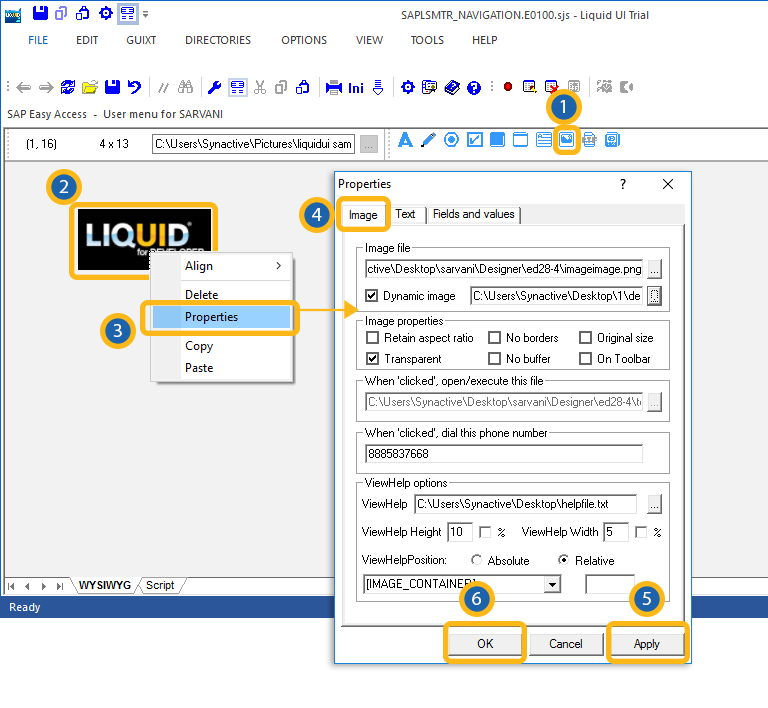
This tab is used to modify the values and parameters associated with images. The available parameters are as follows.
- Image file
-
Specifies the path to the image that you want to use. Currently JPG, GIF, and BMP image types are supported.
- Dynamic image
-
If the image is a dynamic image, use check this box and enter the path into the alongside field instead of the one above it.
- Image properties
-
Specifies several properties associated with images. These are as follows.
- Retain aspect ratio: The image will remain in the same aspect ratio even if you change an aspect such as width or height.
- No borders: The image will not have a border.
- Original size: The image will be displayed in its original size.
- Transparent: The image will be transparent.
- No buffer: The image will not be buffered.
- On Toolbar: The image will be displayed on the toolbar.
- When clicked, open/execute this file
-
Will execute a script or open a file when you click it. Enter the script or file path in the accompanying field. You can use the small button to the right of the main field to browse for the script or file to open.
- When clicked, dial this phone number
-
Enter a telephone number. When the image is clicked, the number will be dialed.
- ViewHelp options
-
If viewhelp is tied to the image, you can set the viewhelp parameters in this section. The availabel parameters are as follows.
- ViewHelp
-
Enter the path to the ViewHelp file. The small '...' button to the right of the main field is used to browse for the file if you do not know the location.
- ViewHelp Height
-
Specifies the height of the viewhelp in pixels. Check the '%' box to enter a percentage instead of an absolute value.
- ViewHelp Width
-
Specifies the width of the viewhelp in pixels. Check the '%' box to enter a percentage instead of an absolute value.
- ViewHelp Position
-
If the position of the image is absolute, enter the position parameters in the field below the 'Relative radiobutton. If the image is relative to another screen element, choose the appropriate screen element from the drop-down list below the 'Absolute' radiobutton.
Text
If an image has text associated with it, this tab is used to specify the associated properties. The Text tab appears as follows:
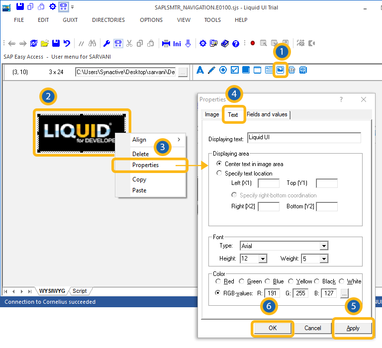
- Displaying text
-
Enter the text to be displayed on the image in this field.
Note: No other fields or controls on this tab will be operable unless you enter text in this field. - Displaying area
-
You can select the parameters to display the text in this section. The availabkle parameters are as follows.
- Center text in image area
-
Click this radio button to center the text in the image.
- Specify text location
-
Click this radiobutton to position text in a specific location. You can specify the distance in pixels from the top (Y1), left (X1), right (X2), and bottom (Y2) edges of the image.
- Font
-
Specifies the font chartacteristics for text entered in the textbox. The available options are as follows.
- Type
-
Specifies the name of the font family. Examples would be Arial, Times, etc.
- Height
-
Specifies the font height in pixels. You can select the height from a drop-down list.
- Weight
-
Specifies the font weight. The default is five (5) but you can modify the weight by selecting it from the drop-down list. Increase the number to make the text heavier; decrease it to make the text lighter.
- Color
-
Select the color of the text here. You can use either color names or RGB values.
- Color names
-
The available color names are as follows.
- Red
- Green
- Blue
- Yellow
- Black
- White
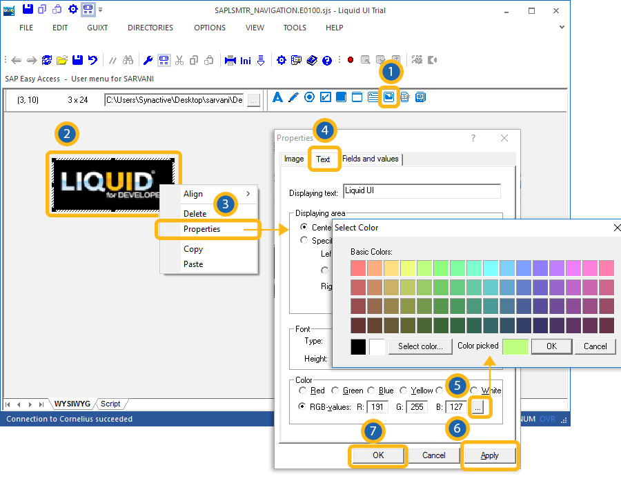
- RGB-values
-
Click this radiobutton to set the colors using RGB values. Use the '...' button to open the color palette shown below.
Fields and values
The Fields and values tab enables you to enter values for the field to be modified. This tab is used for situations where multiple selections can be made, such as order types. The tab appears as shown below:
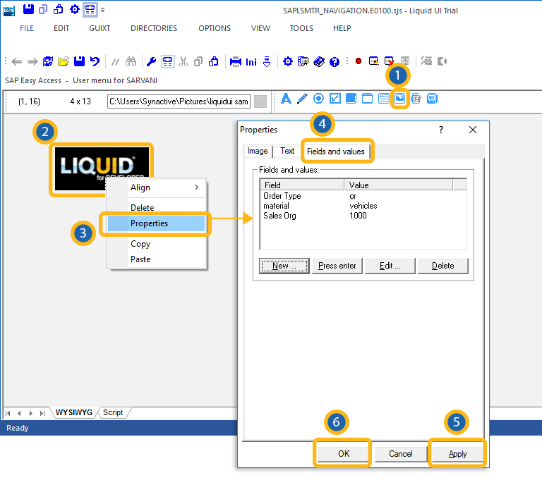
The buttons are defined as follows.
- New
-
Specifies a new field-value pair. To enter a new field-value pair, please do the following.
- Click the New button.
- Enter a selection from the resulting list. If ther are no values available, the list will be blank and you can enter a custom value in the Value field.
- Press enter
-
The Press enter button will cause the radio button to send an Enter command.
- Delete
-
The Delete button will delete the selected field-value pair.
- Edit
-
Enables you to edit an existing field-value pair. To edit, first select a pair from the list and then click the Edit button. You can now edit the field and value.


