The properties dialog for the checkbox element contains two tabs, as follows:
You can manipulate the properties for the checkbox element from this dialog box. The tabs are more fully explained below.
Checkbox
The Check Box tab appears as shown below.
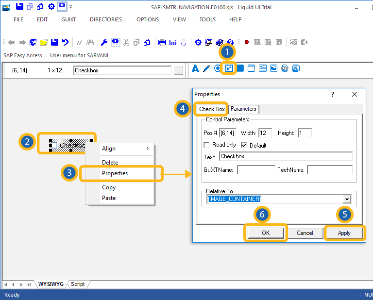
The available parameters are as follows.
- Pos
-
Specifies the checkbox's onscreen coordinates. This is a read-only field - it is not user-modifiable.
- Width
-
Specifies the checkbox's width in pixels. This is also a read-only field.
- Height
-
Specifies the checkbox's height in pixels. It is a read-only field.
- Read-only
-
Specifies that the checkbox is read-only and is not user-modifiable.
- Default
-
Specifies if the checkbox is or is not marked as the default selection. This is useful if you have multiple checkboxes.
- Text
-
Specifies the onscreen label of the checkbox.
- GuiXTName
-
Specifies the GuiXT name of the checkbox. This is a read-only field.
- TechName
-
Specifies the technical name of the checkbox. This is also a read-only field.
- Relative To
-
Specifies the position of the checkbox relative to another screen element. Select the element to position by from the drop-down list.
Parameters
The Parameters tab enables you to link a variable with a specified value. The tab appears as shown below:
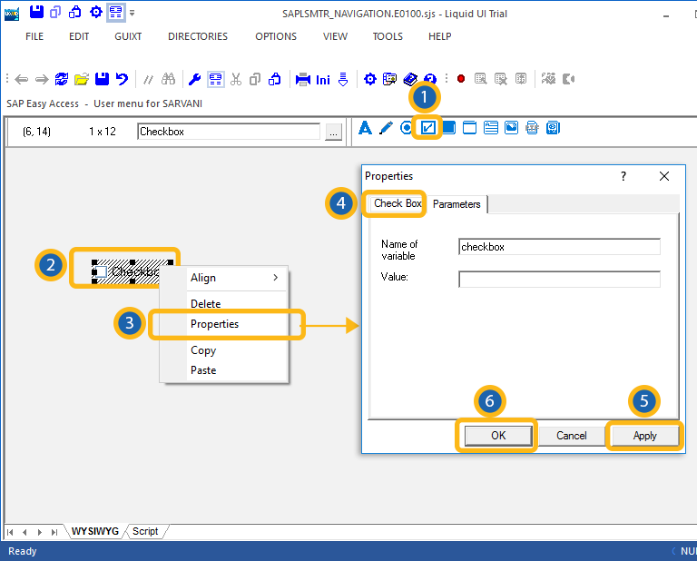
Once you enter a variable name, the 'Value' field will become editable, and you can enter the value you want to link with your new variable.


