With Pushbutton properties, you can view and change the properties of the Pushbutton. For creating a pushbutton, you need Pushbutton command. A Pushbutton on click, trigger an event.
-
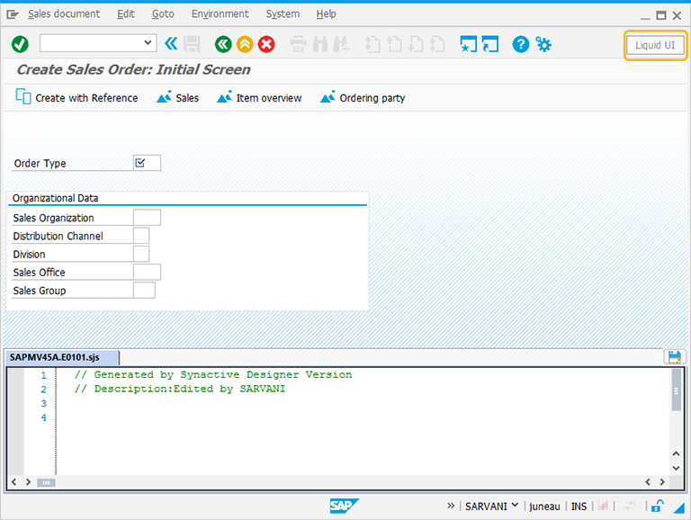
In this article, we will be explaining you the Pushbutton properties with the Pushbutton example, running on Create Sales Order screen. The tcode is VA01. Navigate to VA01 transaction and make sure to activate Liquid UI button. The VA01 screen will appear as following:
-
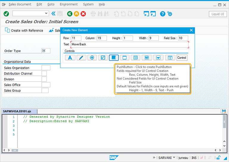
Perform right click on the WYSIWYG editor to place the pushbutton on VA01 screen. The Create New Element window will popup. You will get a tooltip when you place the cursor on the Pushbutton. It will display the fields required for UI control creation and provides you with the default values of pushbutton:
- Height - 1
- Width - 10
- Text - Push
-
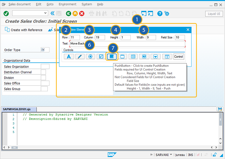
For creating the Pushbutton control, follow the below steps:
- Right click on the screen to view the Create New Element window.
- Enter the Row coordinates of the screen.
- Enter the Column coordinates of the screen.
- Specify the Height for the Pushbutton.
- Specify the Width for the Pushbutton.
- Provide the Text to add the label name for the Pushbutton.
- Click on Pushbutton to create the Pushbutton on the screen.
-
Then you can view the Pushbutton created on the Create Sales Order screen.
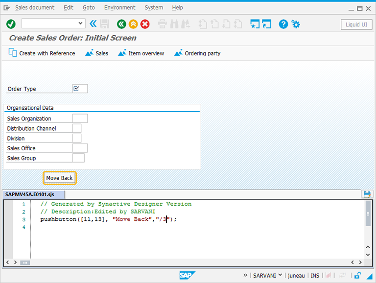
// Creates a Pushbutton with the name Move Back and tcode as /3
pushbutton([12,18],"Move Back","/3");
-
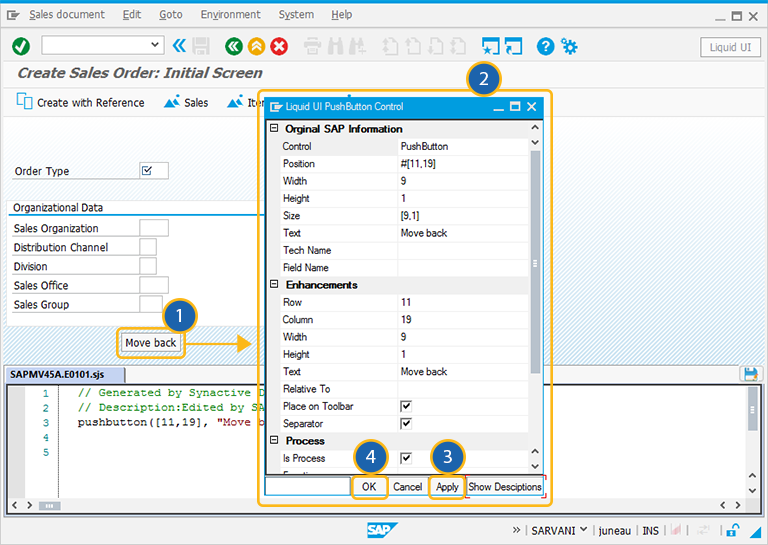
Double click on the Pushbutton. A Property window will appear as shown below:
-
As per the above example, the Pushbutton is named as Move Back. You will navigate to the SAP Easy Access screen, when you click on Move Back pushbutton.
-
To add more functionality to the Pushbutton, You can edit other parameters of the Pushbutton in the properties window which are explained in detail below. You can also edit the script in the Script editor.
The Property window is categorized into following sections and is explained below:
- Original SAP Information: The information provided in this section is not editable. Every Pushbutton has following properties:
- Control: Specifies the screen element.
- Position:Specifies the onscreen coordinates of Pushbutton . This is a read-only field - it is not user-modifiable.
- Width: Specifies the width of Pushbutton in pixels.
- Height: Specifies the height of the Pushbutton in pixels.
- Size: Specifies the coordinates of the Pushbutton in [Width, Height].
- Text: Specifies the onscreen label name of the Pushbutton .
- Tech Name: This field maintains the GuiXT technical name of the Pushbutton .
- Field Name: This field specifies the field name of the Pushbutton . The field name for the Pushbutton is F[Text].
Note: Original SAP Information parameters are non-editable.
- Enhancements: To edit the Pushbutton property, you can edit with Enhancements. It includes the following options:
- Row: Specifies the onscreen row number of the Pushbutton .
- Column: Specifies the onscreen column number of the Pushbutton .
- Width: Specifies the width of Pushbutton in pixels.
- Height: Specifies the height of the Pushbutton in pixels.
- Text: Specifies the onscreen label name of the Pushbutton .
- Relative To: Specifies if the element is being positioned relative to another screen element.
- Place on Toolbar:Toggle value of place on Toolbar field.
- Separator:Toggle value of the Separator field.
- Process: To edit the Pushbutton property, you can edit with process section. It includes the following options:
- Is Process: Specifies if the Pushbutton is marked or not.
- Function: Marked Pushbutton is colored to make it stand out. The color checkboxes located below this field are the various colors you can use to mark Pushbutton.
- Function Browse: If the element is associated with any viewhelp, the source can be specified here.
- Using: Passes values to processes.
- Command: The command tab appears as shown below.
- When ‘Clicked’: Choose an item from the list when the button is click.
- Field Name: Choose available item fields of control.
- Transaction: Represent transaction name of control.


