With Inputfield properties, you can view and change the properties of Inputfields (also called editfields) in SAP. For creating an Inputfield, you need Inputfield command. This command is one of the most useful commands in Liquid UI and is used on most screens.
-
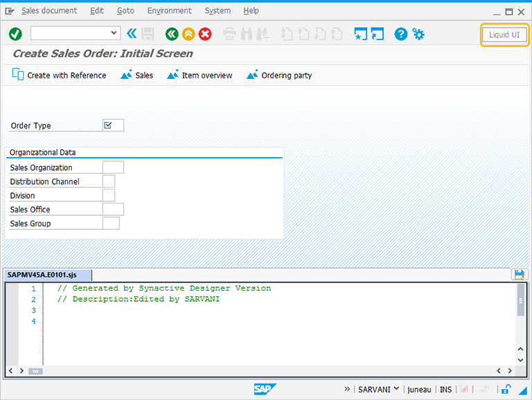
In this article, we will be explaining you the Inputfield properties with an Inputfield example on Create Sales Order screen. The tcode is VA01. Navigate to VA01 transaction and make sure to activate Liquid UI button. Then the VA01 screen will appear as following:
-
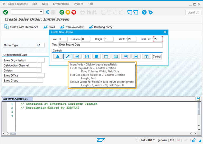
Perform right click on the WYSIWYG editor to place an inputfield. Then Create New Element window will popup. You will get a tooltip, when you place the cursor on the Inputfield. It will display the fields required for UI control creation and provides you with the default values of Inputfield:
- Height - 1
- Width - 20
- Field Size- 8
- Text - Inputfield
-
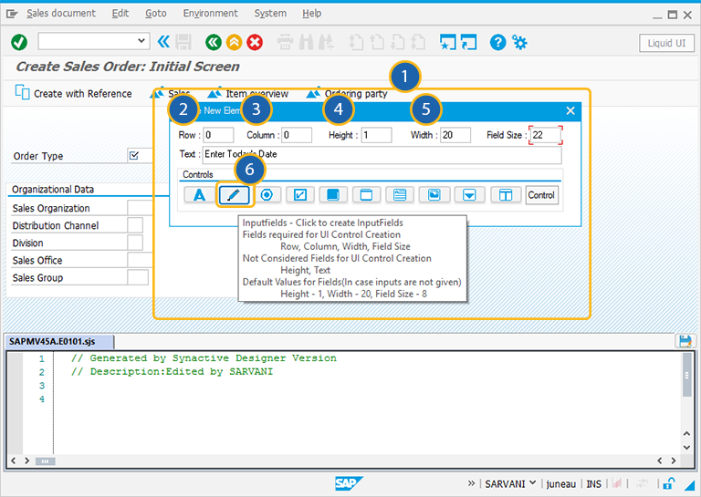
For creating the Inputfield control, follow the below steps:
- Right Click on the screen to view the Create New Element window.
- Enter the Row coordinates of the screen.
- Enter the Column coordinates of the screen.
- Specify the Width for the Inputfield
- Specify the Fieldsize for the Inputfield.
- Click on Inputfield to create the Inputfield on the screen.
// For this Inputfield, the numerical and date options will be set to true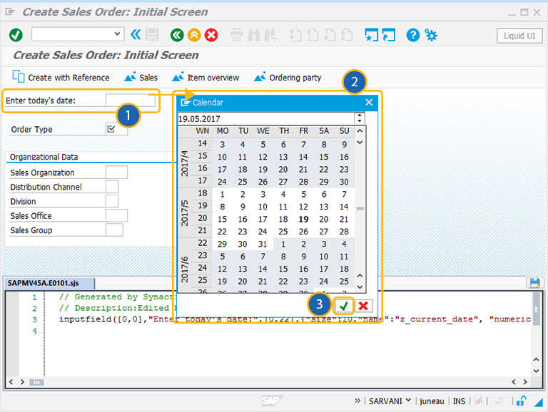
inputfield([0,0],"Enter today's date:",[0,22],{"size":10,"name":"z_current_date","numerical":true,"date":true}); -
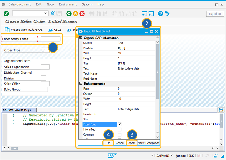
To open the Inputfield properties window, double click on the Inputfield. A popup window will appear as following:
-
When you click search option on the Inputfield a calender is enabled to select the date. You can edit the parameters of the Inputfield in the properties window as per your requirement. To add more functionality to the field, you can edit the script in Script editor.
The Property window is categorized into following sections and is explained below:
- Original SAP Information: The information provided in this section is not editable. Every Inputfield has following properties:
- Control: Specifies the screen element.
- Position:Specifies the onscreen coordinates of Inputfield. This is a read-only field - it is not user-modifiable.
- Width: Specifies the width of Inputfield in pixels.
- Height: Specifies the height of the Inputfield in pixels.
- Size: Specifies the coordinates of the Inputfield in [Width, Height].
- Text: Specifies the onscreen label name of the Inputfield.
- Tech Name: This field maintains the GuiXT technical name of the Inputfield.
- Field Name: This field specifies the field name of the Inputfield. The field name for the Checkbox is F[Text].
Note: Original SAP Information parameters are non-editable.
- Enhancements: To edit the Inputfield property, you can edit with Enhancements. It includes the following options:
- Row: Specifies the onscreen row number of the Inputfield.
- Column: Specifies the onscreen column number of the Inputfield.
- Width: Specifies the width of Inputfield in pixels.
- Height: Specifies the height of the Inputfield in pixels.
- Text: Specifies the onscreen label name of the Inputfield.
- Relative To: Specifies if the element is being positioned relative to another screen element.
- Read-only: Pre-select the Read-only option to make the checkbox as uncheck.
- Default: Select this option to make the checkbox as pre-selected.
- ActualWidth: Represents actual width of the Inputfield.
- No leading zeros: If No leading Zeros is required, check this field.
- Read-only: Disables data entry into the Inputfield.
- Required: Makes the field entry mandatory.
- Intensified: Specifies the Inputfield value in red color, if this parameter is set true.
- Numerical: Allows only numerical input.
- Invisible: Specifies that the values entered in the field will be unreadable to anyone. This typically results in the values being transformed into asterisks.
- Alignright: Specifies that the values entered in the field are aligned with the right-hand edge of the field. Values are left-aligned by default.
- Uppercase: Changes the entered text to uppercase.
- Leading Space: Specifies that there must be a leading space before any other values entered in the field.
- Mark: To edit the Inputfield property, you can edit with Mark section. It includes the following options:
- IsMark: Specifies if the Inputfield is marked or not.
- MarkOptions: Marked Inputfield is colored to make it stand out. The color checkboxes located below this field are the various colors you can use to mark Inputfield.
- Image: If the element is linked to an image, the image path is specified here.
- ViewHelp: If the element is associated with any viewhelp, the source can be specified here.
- ViewHelp Height: Specifies the actual height of the viewhelp window in pixels. Check the smaller checkbox to use the number as a percentage of the original size.
- ViewHelp Width: Specifies the actual width of the viewhelp window in pixels. Check the smaller checkbox to use the number as a percentage of the original size.
- ViewHelp Position: Specifies the onscreen position of the viewhelp window in pixels. This can be either the actual position (absolute) or the position relative to another element.
- Overwrite Default:
- IsOverWrite: If IsOverWrite is required check this field.
- Overwrite with Default: Specifies what the default value for the field will be.
- Search Help: The Search Help section enables user to specify search help for the edit field. The available parameters are as follows.
- Tech Name: Specifies the technical name of the Inputfield.
- Search Help: Specifies the searchhelp domains that will be associated with the Inputfield.
- Fieldname: Specifies the onscreen name of the Inputfield.
- Search Help Process: Specifies if a process is triggered by searchhelp.
- Populate Additional Fields: This section enables you to specify the values that are available for population in a given field. You can specify up to four field that will be auto-populated when the initial field is populated.
- Restrict F4 list: This section is used to restrict the list by entering values to be excluded in the Restrict F4 List section. As in the Populate Additional Fields section, you can specify up to four name-value pairs to be restricted.
- Parameters: The Parameters section enables you to link a variable with a specified value. This section includes:
- Name of the Variable: Represents name of the parameter.
- Value: Represents value of the parameter field.
- CE Settings: The CE Settings tab is used only if the screens being created are intended for use with the Mobile solution. This tab enables you to specify Smart Attribute patterns for the Inputfield. Please see the Mobile documentation for a complete explanation of Smart Attributes and how they are used. The CE Settings section includes:
- Pattern: You can specify a specific character pattern for the edit field.
- Validate: You can specify whether or not the field is to be checked to determine if content is valid.
- Auto Tab Delay: You can specify a delay in seconds before the next field is automatically processed.
- Auto-Submit: You can enter a transaction or a function code to be executed.
- Mark Non-Empty: Check this field to keep Info non-empty.
- Display Only: Check this field to display Info without the edit option.
- Tip: Allows you to add a tooltip to the Inputfield element.


