With Image properties, you can view and change the properties of Image. For creating Image, you need Image command. Using image() command, you can put an Image on SAP screen, toolbar, and can also use an Image as link to help window, launch a website or open a file such as word, pdf, etc.
-
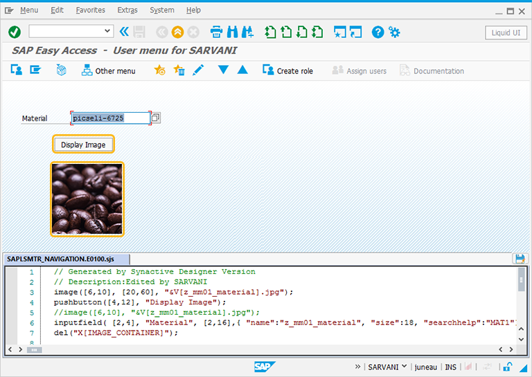
Ìn this article, we will be explaining you the Image properties with an Image example, running on SAP Easy Access screen. Make sure to activate Liquid UI button and apply del command to clear all the elements from the screen as shown below:
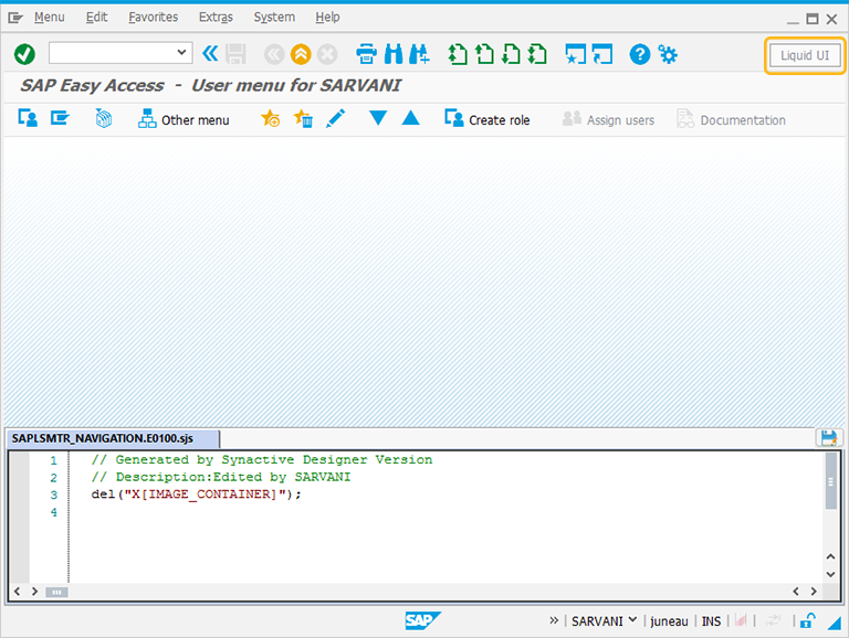
//Deletes the Easy Access Screen elements
del("X[IMAGE_CONTAINER]"); -
Firstly, create an inputfield as Material and pushbutton as Display Image on the screen.
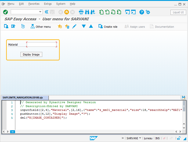
// Creates an inputfield with the label as Material
inputfield([2,4],"Material",[2,16],{"name":"z_mm01_material","size":18,"searchhelp":"MAT1"});
//Creates a pushbutton with the name Display Image and fcode as refresh(?) pushbutton([4,12],"Display Image","?"); -
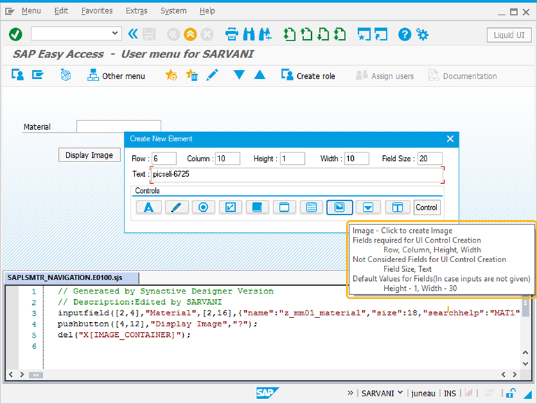
Perform right click on the WYSIWYG editor. The Create New Element window will popup. You will get a tooltip when you place the cursor on the image icon. It will display the fields required for UI control creation and provides you with the default values of image:
- Height - 6
- Width - 24
- Text - Image
-
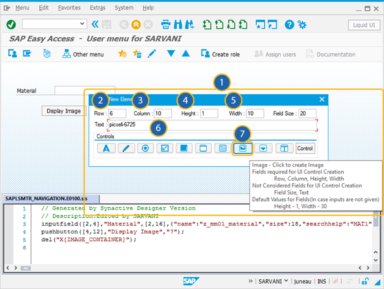
For creating the Image control, follow the below steps:
- Right Click on the screen to view the Create New Element window.
- Enter the Row coordinates of the screen.
- Enter the Column coordinates of the screen.
- Specify the Height for the Image.
- Specify the Width for the Image.
- Provide the Text to add the label name for the Image.
- Click on Image to create the Image on the screen.
//Creates an Image using the value entered in the material field
image([6,10],'&V[z_mm01_material].jpg',{'nostretch':true});
-
Enter the Material name and click on the Display Image button to display the Image of the material on the screen.
-
You can always reposition the Image by just adjusting the screen coordinates, height, and width of the Image on the screen. You can also edit the script in script editor
The Property window is categorized into following sections and is explained below:
- Original SAP Information: The information provided in this section is not editable. Every Image has following properties:
- Control: Specifies the screen element.
- Position: Specifies the onscreen coordinates of Image. This is a read-only field - it is not user-modifiable.
- Width: Specifies the width of Image in pixels.
- Height: Specifies the height of the Image in pixels.
- Size: Specifies the coordinates of the Image in [Width, Height].
- Text: Specifies the onscreen label name of the Image.
- Tech Name: This field maintains the GuiXT technical name of the Image.
- Field Name: This field specifies the field name of the Image.
Note: Original SAP Information parameters are non-editable.
- Enhancements: To edit the Image property, you can edit with Enhancements. It includes the following options:
- Row: Specifies the onscreen row number of the Image.
- Column: Specifies the onscreen column number of the Image.
- Width: Specifies the width of Image in pixels.
- Height: Specifies the height of the Image in pixels.
- Text: Specifies the onscreen label name of the Image.
- Relative To: Specifies if the element is being positioned relative to another screen element.
- Image file: To edit the Image property, you can edit Image file section. It includes the following options:
- Image file: Specifies the path to the Image that you want to use. Currently JPG, GIF, PNG and BMP Image types are supported.
- IsDynamic Image: Check this box, if the Image is dynamic.
- Dynamic Image: Enter the path of the Image into the alongside field instead of the one above it.
- Image Properties: The properties of Image are shown below.
- Retain aspect ratio: check this box to remain the Image in the same aspect ratio even if you change an aspect such as width or height.
- No borders: check this box to have no borders for the Image.
- Original size: check this box to display the Image in its original size.
- Transparent: check this box to make the Image transparent.
- No buffer: The Image will not buffer.
- On Toolbar: The Image will be displayed on the toolbar.
- When clicked open/execute this file: Will execute a script or open a file when you click it. Enter the script or file path in the accompanying field. You can use the small button to the right of the main field to browse for the script or file to open.
- When clicked dial this Phone number: Enter a telephone number. When the Image is clicked, the number will be dialed.
- View Help Options: To edit the Image property, you can edit with Mark section. It includes the following options:
- View Help: If viewhelp is tied to the Image, you can set the viewhelp parameters in this section. The available parameters are as follows.
- ViewHelp Height: Specifies the height of the viewhelp in pixels. Check the '%' box to enter a percentage instead of an absolute value.
- ViewHelp Width: Specifies the width of the viewhelp in pixels. Check the '%' box to enter a percentage instead of an absolute value.
- Help Position: Select whether the position of the Image is Absolute or Relative from the dropdownlist.
- Relative Control Position: If the Image is relative to another screen element, choose the appropriate screen element from the drop-down list.
- Position Path: Enter the position path of the Image.
- Text: If an Image has text associated with it, this section is used to specify the associated properties. The Text section appears as follows:
- Displaying Text: Enter the text to be displayed on the Image in this field.
- Displaying area: You can select the parameters to display the text in this section. The available parameters are as follows.
- Displaying Text area: Click this radio button to center the text in the Image.
- Specify Text Location: Specifies the location of text on the Image.
- Left(X1): specify the distance in pixels from the Left
- Top(Y1): specify the distance in pixels from the Top
- Specify Right-bottom coordinates: Select this checkbox to position text Right-bottom coordinates.
- Right(X2): specify the distance in pixels from the Right.
- Bottom(Y2): specify the distance in pixels from the Bottom.
- Font: Specifies the font characteristics for text entered in the textbox. The available options are as follows.
- Type: Specifies the name of the font family. Examples would be Arial, Times, etc.
- Width: Specifies the font weight. The default is five (5) but you can modify the weight by selecting it from the drop-down list. Increase the number to make the text heavier; decrease it to make the text lighter.
- Height: Specifies the font height in pixels. You can select the height from a drop-down list.
- color: Click here to select the color of the text. This will place the RGB values into the fields automatically .
- R: Represents Red color value in pixels.
- G: Represents Blue color value in pixels.
- B: Represents Green color value in pixels.


