With textbox properties, you can view and change the properties of the textbox. For creating a textbox, you need textbox command.
-
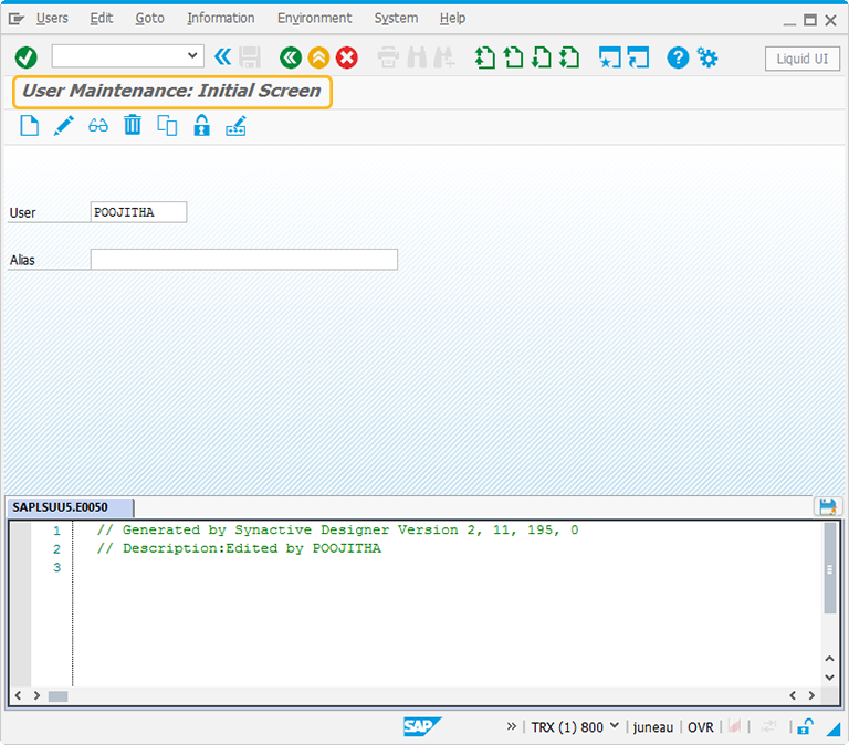
In this article, we will be explaining you the textbox properties with a textbox example, running on User Maintenance screen. The tcode is SU01. Navigate to SU01 transaction and make sure to activate Liquid UI button. The SU01 screen will appear as following:
-
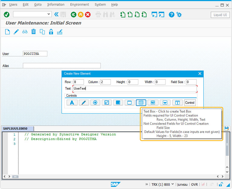
Perform right click on the WYSIWYG editor. The Create New Element window will popup. You will get a tooltip when you place the cursor on the textbox. It will display the fields required for UI control creation and provides you with the default values of textbox:
- Height - 5
- Width - 23
-
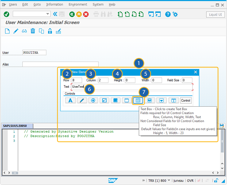
For creating the textbox control, follow the below steps:
- Right click on the screen to view the Create New Element window.
- Enter the Row coordinates of the screen.
- Enter the Column coordinates of the screen.
- Specify the Height for the textbox.
- Specify the Width for the textbox.
- Provide the Text to add the label name for the textbox (optional).
- Click on textbox to create the textbox on the screen.
-
Position the textbox on the screen. You can always reposition it by just adjusting the screen coordinates, height, and width of the textbox on the screen.
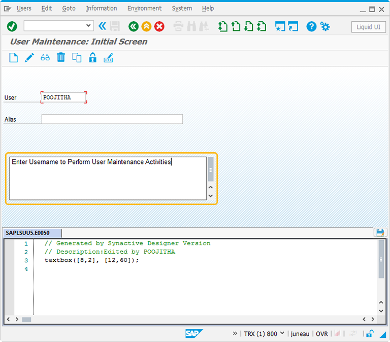
//Create a textbox on the screen
textbox([8,2],[12,60]);
-
Double click on the textbox to select the textbox properties. A popup window will appear and has following:
-
As per the above figure, the textbox is added to the SU01 transaction. To know more about the textbox, click here.
The Property window is categorized into three sections:
- Original SAP Information: The information provided in this section is not editable. Every textbox has following properties:
- Control: Specifies the screen element.
- Position: Specifies the onscreen coordinates of textbox. This is a read-only field - it is not user-modifiable.
- Width: Specifies the width of textbox in pixels.
- Height: Specifies the height of the textbox in pixels.
- Size: Specifies the coordinates of the textbox in [Width, Height].
- Text: Specifies the onscreen label name of the textbox.
- Tech Name: This field maintains the GuiXT technical name of the textbox.
- Field Name: This field specifies the field name of the textbox. The field name for the Textbox is F[Text].
Note: Original SAP Information parameters are non-editable.
- Enhancements: To edit the textbox property, you can edit with Enhancements. It includes the following options:
- Row: Specifies the onscreen row number of the textbox.
- Column: Specifies the onscreen column number of the textbox.
- Width: Specifies the width of textbox in pixels.
- Height: Specifies the height of the textbox in pixels.
- Text: Specifies the onscreen label name of the textbox.
- Relative To: Specifies if the element is being positioned relative to another screen element.
- Read-only: Pre-select the Read-only option to restrict the user entry. The textbox cannot be edited.
- No word wrap: Specifies if the text entered in the textbox will or will not wrap. If this is checked, the text will not wrap. The user has to hit enter to start text from new line.
- Font: Specifies the font for text entered in the textbox. The available options are as follows:
- Type: Specifies the name of the font family. Examples would be Arial, Cambria, etc.
- Weight: Specifies the font weight. The default is five. Increase the number to make the text heavier; decrease to make the text lighter.
- Height: Specifies the font height in pixels.
- Parameters: The Parameters tab enables you to link a variable with a specified value. It has the following fields:
- Name of Variable: Assign the variable name to access the Textbox dynamically
- Value: The 'Value' field will become editable after providing a variable name. You can enter the value you wish to link with your new variable.
- CE Settings: The CE Settings tab is used only if the screens being created are intended to use with Mobile solutions. This tab enables you to specify Smart Attribute patterns for the editfield. The CE Settings tab has following options:
- Pattern: Specify a specific character pattern for the edit field.
- Validate: Specify whether or not the field is to be checked to determine if content is valid.
- Auto Tab: Specify a delay in seconds before the next field is automatically processed.
- Auto-Submit: Specify a transaction or a function code to be executed.
- Mark Non-empty: Check this box to make the input as mandatory.
- Display Only: Check this box to make the textbox as readonly.


