With checkbox properties, you can view and change the properties of the checkbox. For creating a checkbox, you need checkbox command.
-
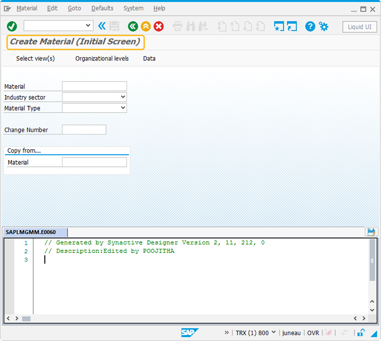
In this article, we will be explaining you the checkbox properties with a checkbox example, running on Create Material screen. The tcode is MM01. Navigate to MM01 transaction and make sure to activate Liquid UI button. The MM01 screen will appear as following:
-
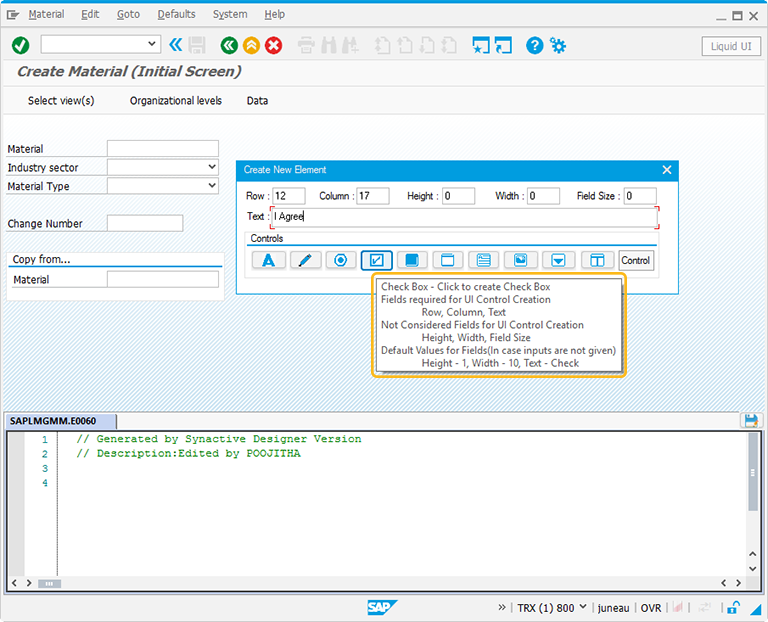
Perform right click on the WYSIWYG editor. The Create New Element window will popup. You will get a tooltip when you place the cursor on the checkbox. It will display the fields required for UI control creation and provides you with the default values of checkbox:
- Height - 1
- Width - 10
- Text - Check
-
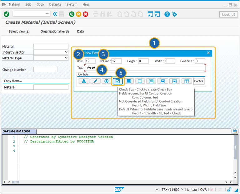
For creating the checkbox control, follow the below steps:
- Right click on the screen to view the Create New Element window.
- Enter the Row coordinates of the screen.
- Enter the Column coordinates of the screen.
- Provide the Text to add the label name for the checkbox.
- Click on checkbox to create the checkbox on the screen.
-
Position the checkbox on any desired location. You can always reposition it by just selecting the checkbox and moving it with a cursor.
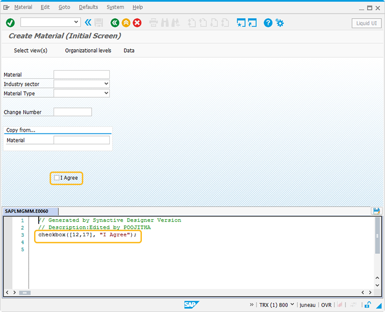
//To create a checkbox with a label name
checkbox([12,17],"I Agree");
-
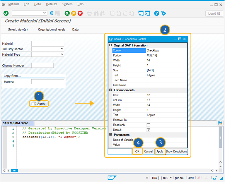
Double click on the checkbox to select the checkbox properties. A popup window will appear as following:
-
As per the above figure, the checkbox is named as I Agree. Select this checkbox after entering the required fields to proceed to the next screen.
The Property window is categorized into three sections:
- Original SAP Information: The information provided in this section is not editable. Every Checkbox has following properties:
- Control: Specifies the screen element.
- Position: Specifies the onscreen coordinates of checkbox. This is a read-only field - it is not user-modifiable.
- Width: Specifies the width of checkbox in pixels.
- Height: Specifies the height of the checkbox in pixels.
- Size: Specifies the coordinates of the checkbox in [Width, Height].
- Text: Specifies the onscreen label name of the checkbox.
- Tech Name: This field maintains the GuiXT technical name of the checkbox.
- Field Name: This field specifies the field name of the checkbox. The field name for the checkbox is C[Text].
Note: Original SAP Information parameters are non-editable.
- Enhancements: To edit the checkbox property, you can edit with Enhancements. It includes the following options:
- Row: Specifies the onscreen row number of the checkbox.
- Column: Specifies the onscreen column number of the checkbox.
- Width: Specifies the width of checkbox in pixels.
- Height: Specifies the height of the checkbox in pixels.
- Text: Specifies the onscreen label name of the checkbox.
- Relative To: Specifies if the element is being positioned relative to another screen element.
- Read-only: Pre-select the Read-only option to make the checkbox as uncheck.
- Default: Select this option to make the checkbox as pre-selected.
- Parameters: The Parameters tab enables you to link a variable with a specified value. It has the following fields:
- Name of Variable: Assign the variable name to access the checkbox dynamically
- Value: The 'Value' field will become editable after providing a variable name. You can enter the value you wish to link with your new variable.


