Purpose
Using the checkbox() you can create and customize checkboxes as needed. This command allows you to select one or more options from a list, and assign default values or set them as read-only. Moreover, you can position checkboxes parallel to other screen elements, which makes selecting multiple options within a group easier. In this article, you will learn about various formats to use the checkbox command.

Note: You can customize the position of the checkbox in different ways. Learn more about positioning the screen elements.
Syntax
You can create checkboxes at desired locations with the required functionalities using the following formats.
Format 1: Adds a checkbox with a label at a specified row and column on the SAP screen.
checkbox([row,col],"label name",{"option":value…});
Note: You can create a checkbox using various options. Learn more about this format.
Format 2: Adds a checkbox without a label at the specified row and column on the SAP screen.
checkbox("[row,col]","label name");
//Creates a checkbox without options
checkbox("[10,13]","Verified");
Note: You can also create a checkbox without options. Learn more about this format.
Format 3: Adds a checkbox with a label at specified row and column coordinates relative to the screen element on the SAP screen.
checkbox("F[screen element]+[row,col]","label name",{"option":value});
//Creates a checkbox with respect to Organization Data groupbox field coordinates
checkbox("G[Organizational Data]+[1,35]","Print repair label",{"name":"print_label","default":" "});

Note: You can also create a checkbox with respect to other screen elements on the screen. Learn more about this format.
Properties
- startrow, startcol – row and column co-ordinates
- label name – name of the checkbox that appears on the screen
- @0Y@labelname - name of the checkbox with icon
- @4V\\Qlable Tip@labelname- name of the checkbox with tooltip and icon
- screen element - field name
Available Options
You can use the following options that are available with the checkbox:
|
"default":X - Checkbox is selected by default. |
|
|
"name":"technical name" - Assigns a technical name to the checkbox for Liquid UI scripts reference. |
|
|
"offset":coordinates - The 'offset' option is used to position the checkbox relative to another screen element. |
|
|
"readonly":true - Checkbox cannot be selected. |
Options Detail
Example 1:
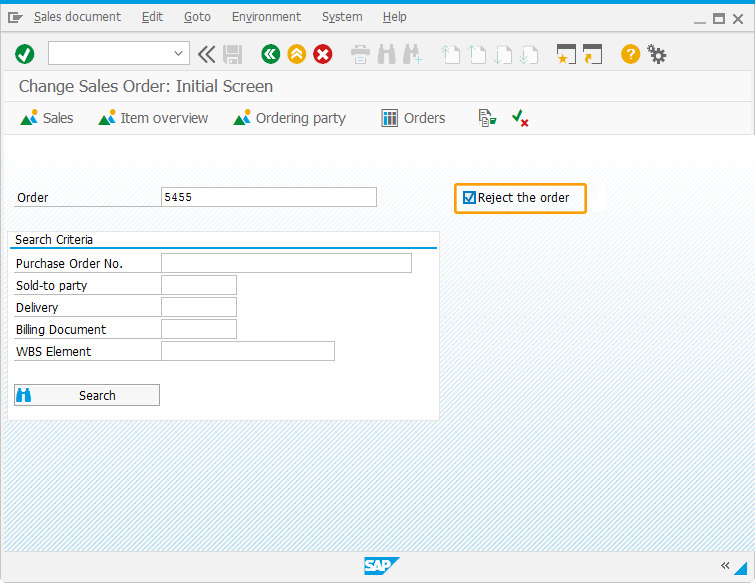
In this example, we have added a checkbox labeled Reject the order to the Change Sales Order: Initial Screen. This allows the user to easily reject an order upon selection.
Script
//Creates a checkbox Reject the Order
checkbox({"field":"F[Order]","offset":[0,25]},"Reject the order",{"name":"z_reject"});
Figure: Checkbox for rejecting the Sales Order
Example 2:
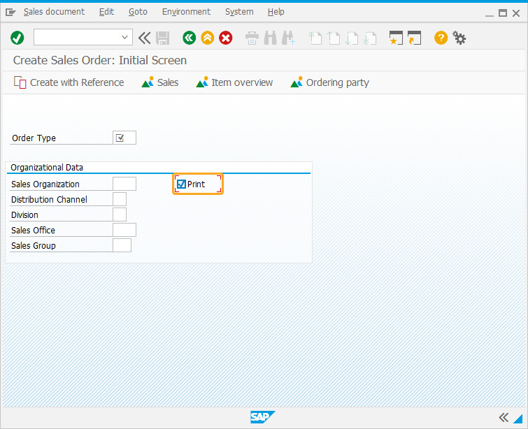
In this example, we have added a checkbox labeled Print within the Organizational Data group box of the Create Sales Order: Initial Screen.
Script
//Creates a checkbox within the group box
checkbox("G[Organizational Data]+[1,35]", "Print",{"name":"print_label", "default":" "});
Tips and Tricks
-
Adding tips to Checkbox
Adding tips to the existing checkbox is depicted on the MB1C transaction of the SAP screen. The Code is as follows.
//SAPMM07M.E0400.sjs
 //Adds a tip to the Print checkbox
tip("C[Print]","Check this to print");
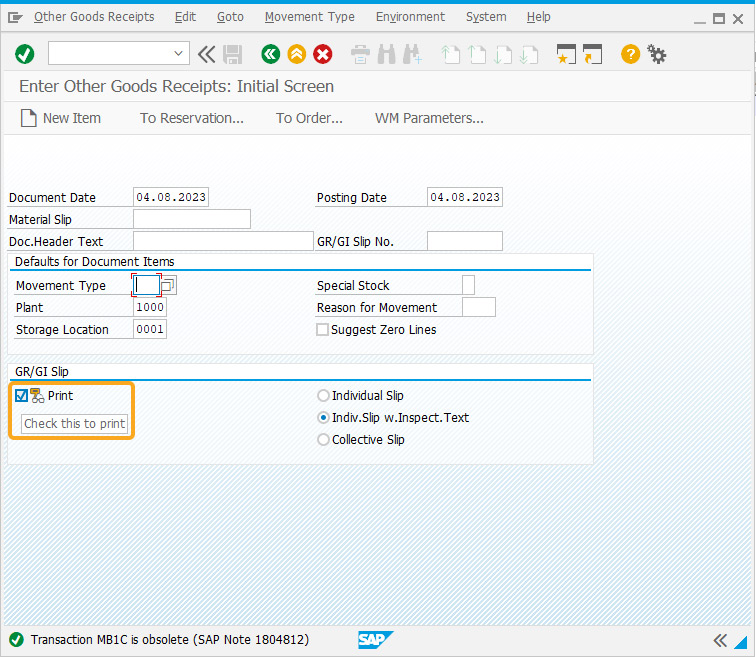
As per the code, the checkbox labeled Print will have a tip Check this to print on the mouse over it.
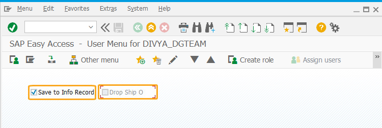
-
Adding a Quick info to the Checkbox
An icon and tip are added to the checkbox, mousehover checkbox displays quick info about it.
//SAPLMGMM.E0060.sjs
//Create a checkbox with a tip and icon
checkbox([1,24],"@01\\Qplease check it to proceed @I Agree");
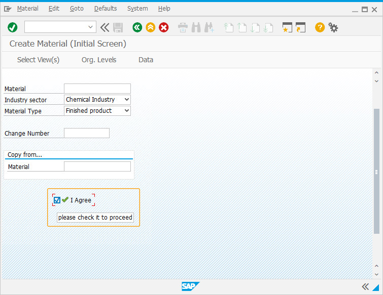
As per the code, the checkbox labeled I Agree will have a tip please check it to proceed on mouseover it.
-
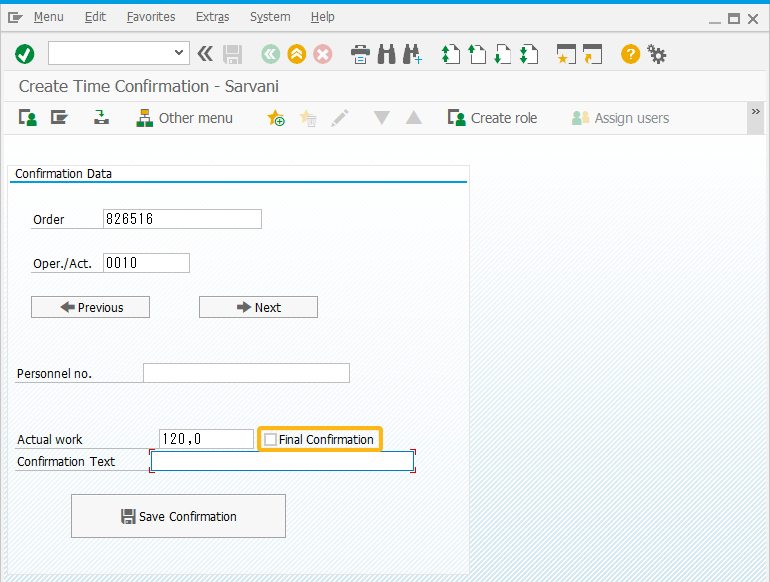
Using set command to select the Checkbox
With the set command, you can pre-check the checkbox by setting the value to "X". Additionally, the checkbox is set as read-only to restrict from selecting. The code is as follows
//SAPLMGMM.E0060.sjs
//Creates a checkbox I Agree
checkbox([1,24],"I Agree",{"readonly":true});
set("C[I Agree]","X");
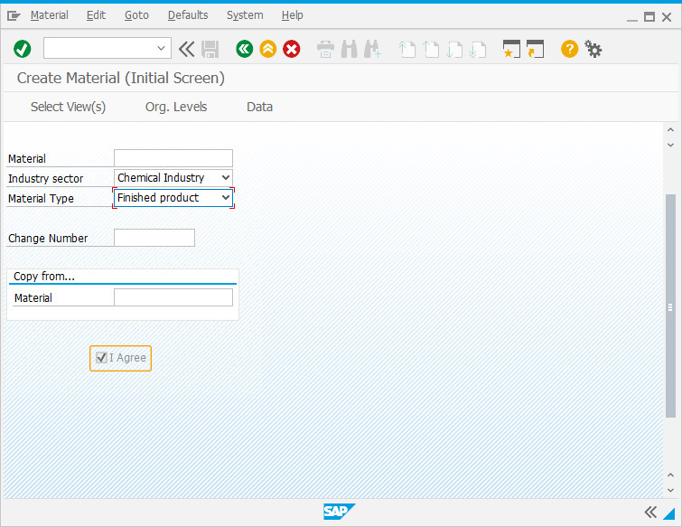
As per the code, the checkbox labeled I Agree is pre-checked and cannot be marked since it is read-only.
-
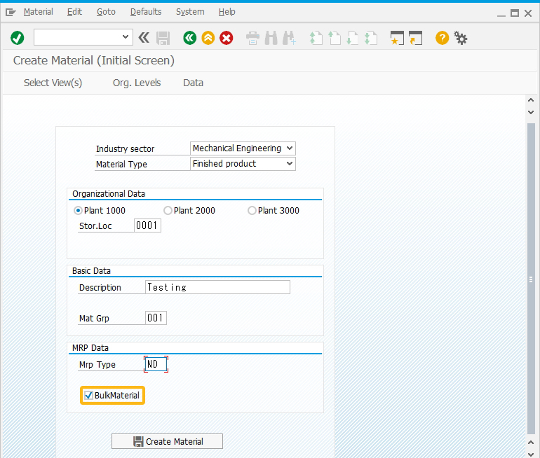
Deletes a Checkbox
Using the del(), you can delete the checkbox on the SAP screen.
//SAPLMGMM.E0060.sjs
//Deletes Bulk Material checkbox
del(“C[BulkMaterial]”);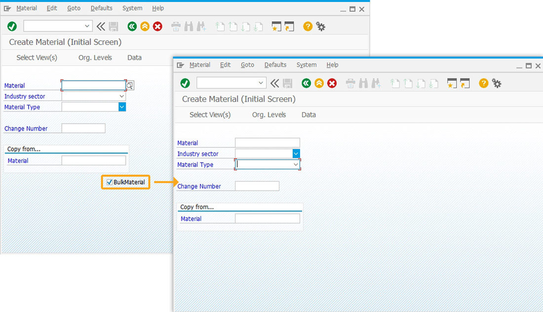


