This section will explain and demonstrate how to perform basic operations in Offline. All screen controls are added within the screen layer. For details please see the Screen Layer section above. Topics covered include:
- Defining screen attributes
- Creating screen captions
- Creating labels
- Creating text fields
- Creating pushbuttons
- Creating checkboxes
- Creating radiobuttons
- Processing functions
Defining screen attributes
The screen that we created in the Using the Client section, now should appear as shown in the following example. In this demonstration, we will add a caption and also define the attributes. Add the following code to the script file:
{type:SCR_CAPTION,label:"Offline Logon",position:{top:0,left:0,bottom:100,right:100},dynproname:”SAPMSYST”,dynpronum:"0020"}
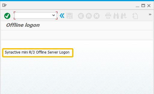
The 'SCR_CAPTION' marker defines the type of attribute we are adding and the 'label' and 'position' markers define the caption's contents and position on the screen. A complete list of all relevant type tags can be found in Screen Manipulation Objects. We have also defined the relative dynpro name and number associated with the new screen. The screen should now appear as shown below:

Creating labels
Now that we have added a caption and defined its attributes, we will add a label to the new screen. To do this, add the following code to the script file:
{type:SCR_LABEL,label:"Synactive mini R/3 Offline Server Logon",position:{row:1,col:1}}
The type marker defines type of attribute we are adding to the screen. In this case, the 'SCR_LABEL' means the new screen will have a title. As in the previous example, the 'label' and 'position' markers define the contents of the label and its position on the screen respectively. The screen will now appear as shown in the following example:
Creating text fields
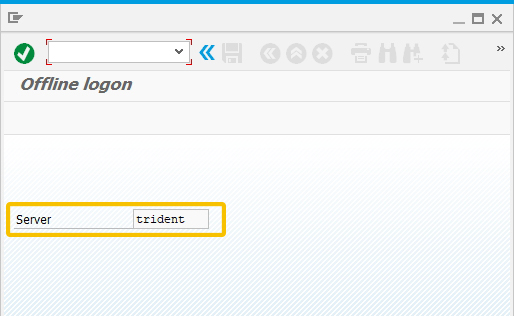
Text fields are one of the most common screen elements. To create a text field on the screen we have just created, add the following code to the script file:
{type:SCR_EDIT,label:"Server",position:{row:3,col:1,edcol:18,edlen:10},fieldname:"RSYST-SEVER",defaultvalue:"trident",maxtextlength:20,style:EDIT_STYLE_READONLY}
In this case, the 'SCR_EDIT' marker defines the type of element we are adding. The 'fieldname' defines the internal name of the element, the 'defaultvalue' tag defines the default value that is within the field, the 'style' tag defines if the field is readonly or not and the 'maxlength' tag defines the maximum number of characters that can be entered in the new field. The screen should now appear as shown in the following example:
Creating pushbuttons
The next step is to add a pushbutton to the new screen. Pushbuttons can be used for a wide variety of functions, from navigating between screens to calling functions that can involve a number of processes.
Screen Buttons
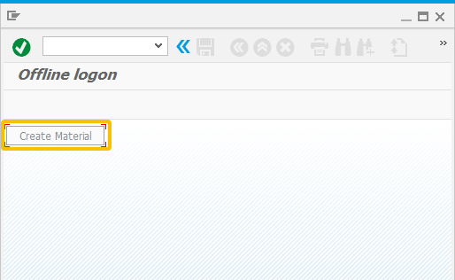
To create a pushbutton on a screen, add the following code to the script file:
{type:SCR_PUSHBUTTON,label:"Create Material",position:{row:0,col:0},fieldname:"SSRET",fcode:"= SSRET",style:BUTTON_STYLE_DISABLE}
The 'SCR_PUSHBUTTON' tag in the above example defines the type of element we are adding to the screen. The other attributes define the pushbutton label, position on the screen, internal field name, function code that will be called when a user presses the button and the style which is disabled in this case. The screen will now appear as in the following example:
Pushbuttons are very useful for calling functions or business processes in SAP. Each pushbutton has a set of attributes, including the following:
- Label: Defines the label of the pushbutton.
- Position: Defines the position of the pushbutton.
- Fcode: Defines the action that needs to happen in the offline client. Any function code (fcode) can be used. Fcodes are usually specified by user. An fcode must include the identifier ' = '.
Please see the Processing Functions section for details on how to process a function via a pushbutton.
Toolbar Buttons
It is possible to edit the options available to the user on the toolbar. In its default state, the toolbar appears as shown in the following example:
Users can add, subtract and edit buttons on the toolbar in Offline. To create a toolbar pushbutton, it is necessary to use the type 'SCR_APPKEY'. In the following example, we are adding a new toolbar button by inputting the displayed into the script file.
{type:SCR_ONAPPKEY,keyid:F5,keylabel:"@2M@Back",keytooltip:"Launch Pad",callback:function
}
Each toolbar pushbutton also has certain attributes, which are as follows:
- keyid: The shortcut of how to execute the toolbar pushbutton
- callback: Calls the desired function
- keytooltip: The tooltip that is displayed when user mouse over the pushbutton
Please see the Processing Functions section for details on how to process a function via a pushbutton.
Function Keys
There are four default function keys (called Fkeys) in the toolbar, as shown below:
These default buttons are as follows (from left to right):
- Save
- Back
- Cancel
- Exit
Each fkey is tied to a unique keyID, which serves to identify the function key to which the generic fkey function is tied to. In this case, the pushbutton is tied to the generic 'Save' function. The code to enable each generic toolbar pushbutton is as follows:
- Save
{type:SCR_ONFKEY,keyid:EVENT_FKEY_SAVE,keylabel:"Save",callback:SR3GenericFunctionKeyF11Save} - Back
{type:SCR_ONFKEY,keyid:EVENT_FKEY_BACK,keylabel:"Back",callback:SR3GenericFunctionKeyF3Back}, - Cancel
{type:SCR_ONFKEY,keyid:EVENT_FKEY_CANCEL,keylabel:"Cancel",callback:SR3GenericFunctionKeyF12Cancel}, - Exit
{type:SCR_ONFKEY,keyid:EVENT_FKEY_EXIT,keylabel:"Exit",callback:SR3GenericFunctionKeySHIFTF3Exit},
After defining the 'Save' fkey, the screen will appear as shown below:
Menu buttons
These buttons are created in a specific sequence. For these buttons to work, screen layer also has to be created in a specific way. There is a generic offline function which creates a menu screen: “addNavigationScreens”
objMM01Tran.addNavigationScreens
(
//scr1
[
{type:SCR_PUSHBUTTON, label:"Offline – 2nd screen",position:{row:1,col:1,width:32},fieldname:"SSCR2",fcode:"=SCR2"},
{type:SCR_PUSHBUTTON,label:"Offline–3rd screen",position:{row:3,col:1,width:32},fieldname:"SSCR3",fcode:"=SCR3},
],
//scr2
[
{type:SCR_PUSHBUTTON,label:"Offline–3rd screen",position:{row:1,col:1,width:32},fieldname:"SSCR3",fcode:"=SCR3"},
{type:SCR_PUSHBUTTON,label:"F3-Back",position:{row:11,col:17,width:15},fieldname:"f3back",fcode:"=sff3back"},
{type:SCR_FUNCTION,funcname:"=sff3back",
callback:function(){this.m_CurrentTransaction.sendScreen(1);}},
],
//scr3
[
{type:SCR_PUSHBUTTON,label:"F3-Back",position:{row:11,col:17,width:15},fieldname:"f3back",fcode:"=sff3back"},
{type:SCR_FUNCTION,funcname:"=sff3back",
callback:function(){this.m_CurrentTransaction.sendScreen(2);}},
]);
Above pushbuttons are created as controls of a menu screen and they use specific Fcodes which navigates user in the order of the screens created by looking at the Fcodes. Menu pushbuttons use Fcodes that are created as:
“SCR” + screen_index
These pushbuttons do not require any SCR_FUNCTION tags to process desired functions. Offline engine looks at the fcode and determines which screen to navigate according to the index specified in the fcode for that particular pushbutton.
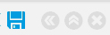
Creating checkboxes
Checkboxes are a convenient method to consolidate actions and options so that users can more easily select an action to perform in SAP. To create a checkbox, add the following code to the script file:
{type:SCR_CHECKBOX,label:"Checkbox Test",position:{row:0,col:1,width:12,height:3}, fieldname:"g_mm01_checkbox",defaultvalue:"X",
style:EDIT_STYLE_READONLY}
Checkboxes are type 'SCR_CHECKBOX'. For checkboxes, only the styles EDIT_STYLE_READONLY, or EDIT_STYLE_NORMAL are used. The attributes include the label, the position on the screen, the internal field name, the default value - 'X' indicates the checkbox is checked by default - and the style, indicating if the checkbox is hidden or not. The screen now appears as shown in the following example:
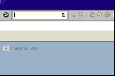
Creating radiobuttons
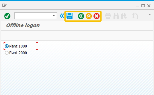
Radiobuttons are another convenient method to give users an easier path to performing actions and selecting options in SAP. Instead of presenting a user with multiple screens and fields, a set of radiobuttons enables users to quickly and painlessly make decisions and perform actions in SAP. To add a radiobutton to a screen, input the following code into the script file:
{type:SCR_RADIOBUTTON,control:[{label:"Plant 1000",value:"1000",position:{row:0,col:1,width:10,height:1},defaultvalue:"X"},{label:"Plant 2000",value:"2000",position:{row:1,col:1,width:10,height:1}}],
fieldname:"g_mm01_plant_radiobutton",style:EDIT_STYLE_NORMAL}
The type tag is 'SCR_CHECKBOX' and the attributes used in the preceding example include the label, position on the screen, internal fieldname, the default value of the radiobutton - 'X' indicates that it is selected - and the style, which in this case is hidden. The screen now appears as shown in the following example:
Processing Functions
Creating functions is also done by means of a screen control in Offline. Functions are processed using the SCR_FUNCTION tag. There are two kinds of functions in offline
- Generic functions: These functions are predefined API’s that can be called either from a usercreated application on a pushbutton.
- Custom functions: These functions are user-created and user- defined functions.
In this section, we will discuss what can be done with the SCR_FUNCTION tag in Offline as well as its properties, such as callback. Topics covered are as follows:
- Screen buttons
- Toolbar buttons
- Passing values to a screen (PBO)
Using Screen Buttons
This example will explain how to navigate to a given screen by executing the screen button that we defined in the Screen Button section earlier. To do this, we will add the following code in the script file within the current screen layer where the pushbutton is created.
{type:SCR_FUNCTION,funcname:"=validate",callback:displayValues};
function displayValues( ){
var vGetDelNo = this.m_RealTimeScreen.GetElementValue("z_del_no",SCR_EDIT);
var vGetDelItm = this.m_RealTimeScreen.GetElementValue("z_del_itm",SCR_EDIT);
this.m_CurrentTransaction.sendScreen(2);
}
The preceding code contains the following attributes and methods:
- funcname: This is the function name that is defined in the pushbutton.
- callback: Calls the desired process.
- getElementValue: This method stores the desired value in a screen control. The value can go either to a variable or it can be used directly.
In this example the pushbutton will. take the user to the second screen of a transaction. If no second screen exists, the application will display an error message informing user that there is no second screen.
Using Toolbar buttons
This example will explain how to navigate to a given screen by executing the button defined on the toolbar in the Toolbar Button section. We already defined a pushbutton on the toolbar within the current screen layer with the following code:
{type:SCR_ONAPPKEY,keyid:F5,keylabel:"@2M@Back",keytooltip:"Launch Pad",callback:changeScreen
}
Now we will define the function that will be executed when the user defines this pushbutton:
function() {
this.m_CurrentTransaction.sendScreen(1);
}
PBO – Displaying values on a screen
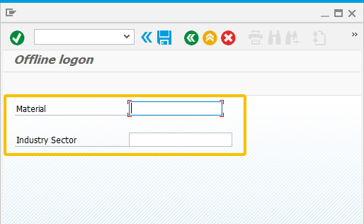
We had previously defined a pushbutton on the screen in the Screen Button section. This pushbutton takes us to the second screen of this particular transaction, so we have to create a second screen which will display default values.
To do this, we will add the following code to the end of the script.
objMM01Tran.addScreen([
{type:SCR_EDIT,label:"Material",position:{row:0,col:2,edcol:25,edlen:18},fieldname:"g_mm01_material"},
{type:SCR_EDIT,label:"Industry Sector",position:{row:2,col:2,edcol:25,edlen:20},fieldname:"g_mm01_indesc"}
]);
The second screen is as shown below:
To display default values on this screen we will use process before output (PBO) generic offline function as shown in the following example. We will use the setElementValue method to set data contained in variables to the real time screen. PBO is executed before each screen gets painted and display any outcome retrieved in that function to the user. The Send method is used to send the user a message indicating the success of the process:
{type:SCR_FUNCTION,funcname:FUNCTION_PBO,callback:function( ) {
this.m_RealTimeScreen.SetElementValue("g_mm01_material",SCR_EDIT,“10011”);
this.m_RealTimeScreen.SetElementValue("g_mm01_indesc",SCR_EDIT,“Chemical”);
this.m_RealTimeScreen.Send("Delivery is validated!",MESSAGE_TYPE_SUCCESS);
}
}
In the preceding script, the setElementValue method sets the desired value to the screen control. Variables can be used as well.


