With Groupbox properties, you can view and change the properties of the Groupbox. For creating a Groupbox, you need box command.
-
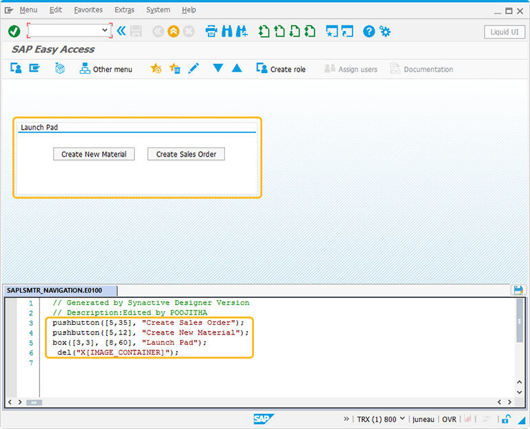
In this article, we will be explaining you the Groupbox properties with a launch pad example, running on SAP Easy Access screen. Make sure to activate Liquid UI button on SAP screen and apply del command to clear all the elements from the screen as shown below:
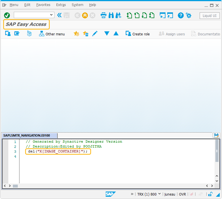
//Delete the Easy Access Screen elements
del("X[IMAGE_CONTAINER]"); -
At first, create two pushbuttons of Create New Material and Create Sales Order. These pushbuttons represent the 2 different transactions.
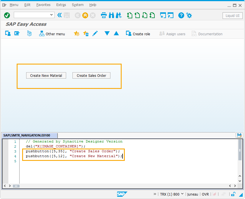
//Create pushbuttons for Create Sales Order and Create New Material
pushbutton([5,35],"Create Sales Order");
pushbutton([5,12],"Create New Material");
-
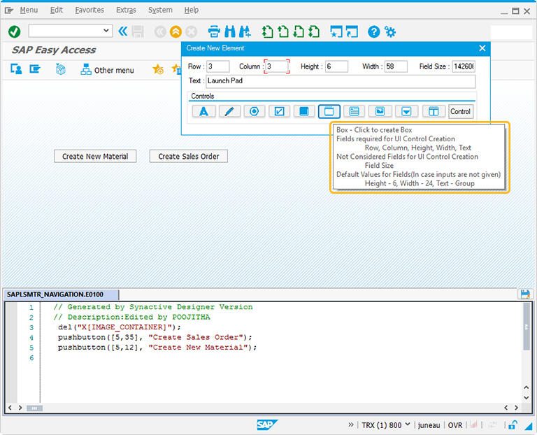
Then, right click on the WYSIWYG editor to create a Groupbox surrounding the pushbuttons. The Create New Element window will popup. You will get a tooltip when you place the cursor on the Groupbox. It will display the fields required for UI control creation and provides you with the default values of Groupbox:
- Height - 6
- Width - 24
- Text - Group
-
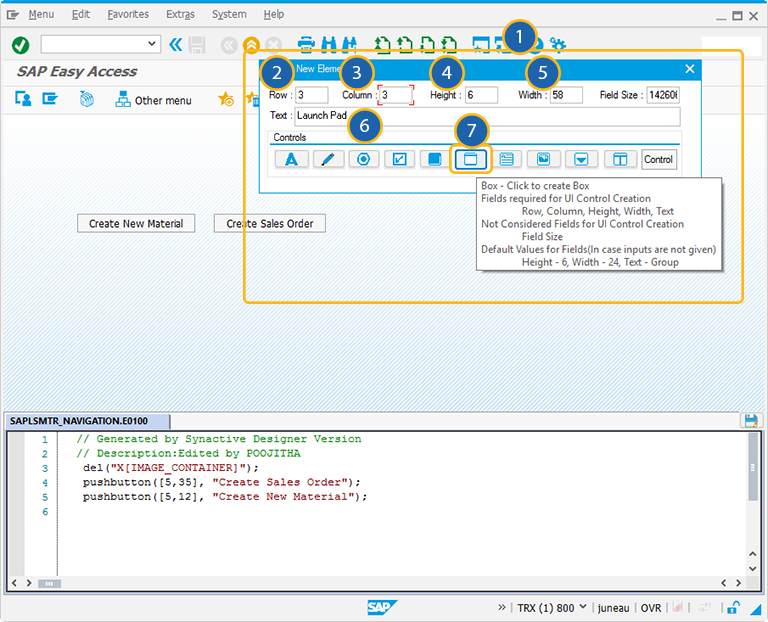
For creating the Groupbox control, follow the below steps:
- Right click on the screen to view the Create New Element window.
- Enter the Row coordinates of the screen.
- Enter the Column coordinates of the screen.
- Specify the Height for the Groupbox.
- Specify the Width for the Groupbox.
- Provide the Text to add the label name for the Groupbox.
- Click on Box to create the Groupbox on the screen.
//Create Groupbox around the pushbuttons
box([3,3],[8,60],"Launch Pad");
-
Position the Groupbox around the elements. You can always reposition it by just adjusting the screen coordinates, height, and width of the Groupbox on the screen.
-
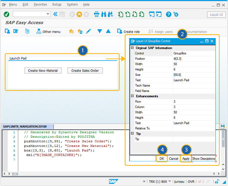
Double click on the Groupbox to select the Groupbox properties. A popup window will appear as following:
-
As per the above example, the Groupbox is named as Launch Pad. To know more about how the Launch pad is created, click here.
The Property window is categorized into three sections:
- Original SAP Information: The information provided in this section is not editable. Every Groupbox has following properties:
- Control: Specifies the screen element.
- Position: Specifies the onscreen coordinates of Groupbox. This is a read-only field - it is not user-modifiable.
- Width: Specifies the width of Groupbox in pixels.
- Height: Specifies the height of the Groupbox in pixels.
- Size: Specifies the coordinates of the Groupbox in [Width, Height].
- Text: Specifies the onscreen label name of the Groupbox.
- Tech Name: This field maintains the GuiXT technical name of the Groupbox.
- Field Name: This field specifies the field name of the Groupbox. The field name for the Groupbox is G[Text].
Note: Original SAP Information parameters are non-editable.
- Enhancements: To edit the Groupbox property, you can edit with Enhancements. It includes the following options:
- Row: Specifies the onscreen row number of the Groupbox.
- Column: Specifies the onscreen column number of the Groupbox.
- Width: Specifies the width of Groupbox in pixels.
- Height: Specifies the height of the Groupbox in pixels.
- Text: Specifies the onscreen label name of the Groupbox.
- Relative To: Specifies if the element is being positioned relative to another screen element.
- Tip: Allows you to add a tooltip to the Groupbox element.


